Presentation of Data (Statistics for Economics) — Important Questions
59 questions
With answersCBSE format
SUMMARY: This chapter focuses on the methods and techniques used to present statistical data effectively in economics. KEY TOPICS: tabular presentation, diagrammatic presentation, graphical presentation, frequency distribution, bar diagrams, pie charts, histograms, frequency polygons, ogives, data interpretation
A histogram is most suitable for which type of data?
AQualitative
BDiscrete
CContinuous grouped data
DTime series with gaps
Check answerHide answer
Correct answer: Option 3 — Continuous grouped data
Q21 Mark
In a pie diagram the total angle representing 100% of the data is:
A180°
B270°
C360°
D100°
Check answerHide answer
Correct answer: Option 3 — 360°
Q31 Mark
An ogive is used to show:
ACumulative frequency
BSimple frequency
CClass interval only
DCorrelation
Check answerHide answer
Correct answer: Option 1 — Cumulative frequency
Q41 Mark
A bar diagram displays bars that are:
AAlways adjacent
BSeparated by equal gaps
COverlapping
DTriangular
Check answerHide answer
Correct answer: Option 2 — Separated by equal gaps
Q51 Mark
A frequency polygon is obtained by joining the:
AClass limits
BMid-points of the tops of adjacent rectangles
CCumulative frequencies at class boundaries
DUpper limits of each class
Check answerHide answer
Correct answer: Option 2 — Mid-points of the tops of adjacent rectangles
Q61 Mark
Which of the following is the most suitable diagram for showing the comparison of different components as a proportion of the whole?
ABar diagram
BHistogram
CPie chart
DFrequency polygon
Check answerHide answer
Correct answer: Option 3 — Pie chart
Q71 Mark
In a frequency distribution, the class mark is calculated as:
AUpper limit minus lower limit
BSum of upper and lower limits divided by 2
CLower limit multiplied by frequency
DUpper limit divided by frequency
Check answerHide answer
Correct answer: Option 2 — Sum of upper and lower limits divided by 2
Q81 Mark
Which graphical presentation is used to represent cumulative frequency distribution?
AHistogram
BFrequency polygon
CBar diagram
DOgive
Check answerHide answer
Correct answer: Option 4 — Ogive
Q91 Mark
A histogram differs from a bar diagram in which of the following ways?
AHistogram uses circles while bar diagram uses rectangles
BIn a histogram, bars are drawn with no gaps between them representing continuous data
CA histogram can only represent qualitative data
DBar diagrams always represent frequency distributions
Check answerHide answer
Correct answer: Option 2 — In a histogram, bars are drawn with no gaps between them representing continuous data
Q101 Mark
In tabular presentation of data, a 'stub' refers to:
AThe title given at the top of the table
BThe headings of the columns in a table
CThe row headings or descriptions on the left side of the table
DThe source note given below the table
Check answerHide answer
Correct answer: Option 3 — The row headings or descriptions on the left side of the table
Q111 Mark
A frequency polygon is constructed by joining the midpoints of the tops of rectangles in a histogram. What additional points are included to close the polygon?
AThe highest and lowest class frequencies
BThe midpoints of two hypothetical classes with zero frequency at each end
CThe upper and lower limits of the first and last class
DThe cumulative frequencies of the first and last class
Check answerHide answer
Correct answer: Option 2 — The midpoints of two hypothetical classes with zero frequency at each end
Q121 Mark
If the total angle of a pie chart is 360° and a particular component constitutes 25% of the total data, what will be the angle allocated to that component?
A25°
B45°
C90°
D180°
Check answerHide answer
Correct answer: Option 3 — 90°
Q131 Mark
In a 'less than' ogive, the cumulative frequency is plotted against which value of each class interval?
ALower limit of the class
BClass mark (midpoint) of the class
CUpper limit of the class
DFrequency of the class
Check answerHide answer
Correct answer: Option 3 — Upper limit of the class
Q141 Mark
When class intervals in a frequency distribution are unequal, the histogram is drawn using frequency density on the Y-axis. Frequency density is defined as:
AFrequency multiplied by class width
BFrequency divided by class width
CCumulative frequency divided by total frequency
DClass width divided by total number of observations
Check answerHide answer
Correct answer: Option 2 — Frequency divided by class width
Q151 Mark
The intersection point of a 'less than' ogive and a 'more than' ogive on a graph corresponds to which statistical measure?
AMean
BMode
CMedian
DStandard deviation
Check answerHide answer
Correct answer: Option 3 — Median
Short Answer Questions10 questions
Q163 Marks
State any two advantages of tabular presentation of data.
View sample solutionHide solution
(i) It organises data compactly, making comparison and reference easy. (ii) It provides a base for further analysis and diagrammatic or graphical presentation. It also avoids the repetition typical of descriptive paragraphs.
Q173 Marks
Distinguish between a bar diagram and a histogram.
View sample solutionHide solution
A bar diagram is used for discrete or qualitative data; its bars are separated by equal gaps and the height shows the value. A histogram is used for continuous grouped data; its bars are drawn adjacent to each other and the area represents the frequency of each class.
Q183 Marks
What is an ogive?
View sample solutionHide solution
An ogive is the graph of a cumulative frequency distribution. Plotting cumulative frequencies against upper class limits gives a less-than ogive (rising curve); plotting cumulative frequencies against lower class limits gives a more-than ogive (falling curve). The median can be located from its intersection with the line at N/2.
Q193 Marks
State the main parts of a good statistical table.
View sample solutionHide solution
(i) Title — brief, clear description of content; (ii) Head-note — unit of measurement or geographical coverage; (iii) Captions (column headings) and stubs (row headings); (iv) Body — numerical values; (v) Source note — origin of the data; (vi) Footnotes — clarifications. Together these make the table self-explanatory.
Q203 Marks
Define a frequency polygon. How is it different from an ogive?
View sample solutionHide solution
A frequency polygon plots mid-points of class intervals on the X-axis against their frequencies on the Y-axis, joining the points by straight lines. An ogive plots upper (or lower) class limits against cumulative frequencies. The polygon shows the shape of the distribution; the ogive shows how cumulative frequency grows and is used to read medians and quartiles graphically.
Q213 Marks
What is a frequency distribution table and why is it used in statistics?
View sample solutionHide solution
A frequency distribution table is a systematic arrangement of data that shows how often each value or group of values occurs in a dataset. It is used to organize raw data into a compact and meaningful form, making it easier to analyze and interpret large sets of data. It helps in identifying patterns and trends within the data.
Q223 Marks
What is a pie chart? How is the angle for each component calculated?
View sample solutionHide solution
A pie chart is a circular diagram divided into sectors, where each sector represents a component's share of the total. The angle for each component is calculated using the formula: Angle = (Component Value / Total Value) × 360°. It is useful for showing the relative proportions of different parts of a whole.
Q233 Marks
What is an ogive and what are its two types?
View sample solutionHide solution
An ogive is a graphical representation of a cumulative frequency distribution, drawn by plotting cumulative frequencies against class boundaries. The two types are the 'less than ogive,' where cumulative frequencies are plotted against upper class boundaries, and the 'more than ogive,' where cumulative frequencies are plotted against lower class boundaries. The intersection of the two ogives gives the median of the data.
Q243 Marks
State any two advantages of diagrammatic presentation of data.
View sample solutionHide solution
First, diagrams make complex statistical data simple and easy to understand at a glance, even for a layperson without statistical knowledge. Second, diagrams have a greater visual impact and are more attractive and memorable compared to tables or textual data, making them effective for comparison and communication.
Q253 Marks
What is a frequency polygon and how is it constructed?
View sample solutionHide solution
A frequency polygon is a line graph that represents the frequency distribution of a dataset. It is constructed by plotting the midpoints of each class interval against their corresponding frequencies and then joining these points with straight lines. It can also be drawn by connecting the midpoints of the tops of the bars in a histogram.
Long Answer Questions6 questions
Q266 Marks
Explain the main types of diagrams used for data presentation, with examples.
View sample solutionHide solution
(1) Simple bar diagram — vertical or horizontal bars whose length is proportional to the value; used for a single variable across categories (e.g. state-wise literacy). (2) Multiple / compound bar diagram — several bars per category, used to compare two or more related variables (e.g. male / female literacy by state). (3) Component (sub-divided) bar diagram — each bar is sub-divided to show parts of a whole (e.g. sectoral share of GDP over years). (4) Pie diagram — a circle split into sectors in proportion to the categories; best for shares of a whole at one point in time. (5) Histogram — rectangles drawn on class intervals of a continuous frequency distribution; area is proportional to frequency. (6) Frequency polygon — join mid-points of histogram tops. (7) Ogive — cumulative-frequency curve. Choice of diagram depends on the nature of data (continuous vs discrete, one vs many variables) and the message to convey.
Q276 Marks
Compare tabular and diagrammatic presentation of data.
View sample solutionHide solution
Tabular presentation arranges data in rows and columns; diagrammatic presentation uses bars, pies, histograms etc. Points of comparison: (1) Precision — tables give exact figures; diagrams give an approximate visual impression. (2) Speed of communication — diagrams convey the 'big picture' faster, especially to non-specialist audiences. (3) Comparability — diagrams make comparisons more immediate (which bar is tallest) but tables allow rigorous comparison across many categories. (4) Use in further analysis — tables are the input to subsequent computations; diagrams are usually the output. (5) Space — diagrams often take more space but convey shape of distribution at a glance. Good reports typically use both: the table for record, the diagram for effect.
Q286 Marks
Describe the construction of a pie diagram using the example of sectoral share of Indian GDP (agriculture 18%, industry 28%, services 54%).
View sample solutionHide solution
Steps: (1) Convert each share to a central angle = (value / total) × 360°. Agriculture: 0.18 × 360° = 64.8°; Industry: 0.28 × 360° = 100.8°; Services: 0.54 × 360° = 194.4°. (2) Draw a circle of convenient radius. (3) Starting from the 12-o'clock position, mark an angle of 64.8° for agriculture using a protractor; shade and label with the percentage. (4) From that radius, mark another 100.8° for industry; shade and label. (5) The remaining 194.4° automatically represents services; shade and label. (6) Add a legend, title and source. The viewer instantly sees services as the biggest slice of the Indian economy. Pie diagrams work best when there are 2-6 categories summing to 100%.
Q296 Marks
Distinguish between a histogram and a frequency polygon.
View sample solutionHide solution
Histogram — adjacent rectangles drawn over continuous class intervals; width = class width, height = frequency (or frequency density for unequal classes). The area of each rectangle represents frequency. It gives a clear picture of the shape of the distribution. Frequency polygon — obtained by joining the mid-points of the tops of histogram rectangles by straight lines, and closing the polygon by dropping the end points to the mid-points of the preceding and following (empty) classes on the X-axis. It can also be drawn directly from mid-point vs frequency without the histogram. Polygons are convenient for comparing two or more distributions on the same graph, which overlapping histograms cannot show clearly.
Q306 Marks
Explain the components of a good statistical table.
View sample solutionHide solution
A good table has: (1) Title — concise description of the table's content, placed at the top. (2) Table number — for cross-referencing when the document has many tables. (3) Head note — unit of measurement, geographical coverage, time period. (4) Captions — column headings that describe what the column contains. (5) Stubs — row headings that describe what each row contains. (6) Body — the cells of numerical data, the heart of the table. (7) Footnotes — explain any special items, exceptions or methods. (8) Source note — states the data provider (e.g. NSO, RBI Annual Report). Together these make the table self-explanatory — a reader should be able to understand it without referring to the accompanying text.
Q316 Marks
Compare bar diagram and histogram with the help of a table on five features.
Assertion–Reason Questions8 questions
Q321 Mark
Assertion (A): Diagrams communicate data faster than paragraphs or even tables.
Reason (R): A well-drawn chart conveys the main pattern in the data at a glance to a non-technical reader.
Show explanationHide explanation
Correct answer: Option 1 —
Both A and R are true, and R is the correct explanation of A.
Q331 Mark
Assertion (A): A histogram is suitable for continuous frequency distributions.
Reason (R): Adjacent bars represent the continuous class intervals without gaps.
Show explanationHide explanation
Correct answer: Option 1 —
Both A and R are true, and R is the correct explanation of A.
Q341 Mark
Assertion (A): A pie diagram is best when the data represent components of a whole.
Reason (R): The circular form and 360° total make it visually clear that slices sum to 100%.
Show explanationHide explanation
Correct answer: Option 1 —
Both A and R are true, and R is the correct explanation of A.
Q351 Mark
Assertion (A): An ogive is drawn using cumulative frequencies.
Reason (R): Graphing cumulative frequencies against the relevant class limits traces the accumulated count up to each point.
Show explanationHide explanation
Correct answer: Option 1 —
Both A and R are true, and R is the correct explanation of A.
Q361 Mark
Assertion (A): Bar diagrams can only be used for discrete data.
Reason (R): Bars are always separated by equal gaps irrespective of whether the data are discrete or continuous.
Show explanationHide explanation
Correct answer: Option 3 —
A is true, but R is false.
Q371 Mark
Assertion (A): A histogram is used to represent continuous frequency distributions.
Reason (R): In a histogram, the class intervals are marked on the X-axis and the frequencies are represented by the heights of the rectangles drawn without any gap between them.
Show explanationHide explanation
Correct answer: Option 1 —
Both A and R are true, and R is the correct explanation of A.
Q381 Mark
Assertion (A): A pie chart is also known as a divided circle diagram.
Reason (R): In a pie chart, the entire circle representing 360 degrees is divided into sectors proportional to the values of the components being represented.
Show explanationHide explanation
Correct answer: Option 1 —
Both A and R are true, and R is the correct explanation of A.
Q391 Mark
Assertion (A): Bar diagrams can only be drawn vertically.
Reason (R): Horizontal bar diagrams are commonly used when the number of items to be compared is large or when the category labels are long.
Show explanationHide explanation
Correct answer: Option 4 —
A is false, but R is true.
Statement-Based Questions8 questions
Q401 Mark
Statement 1: Title, source and footnotes are parts of a statistical table.
Statement 2: Captions are the column headings and stubs are the row headings.
Show answerHide answer
Correct answer: Option 1 —
Both statements are true.
Q411 Mark
Statement 1: A pie diagram shows parts as slices of a circle in proportion to their share.
Statement 2: Each slice subtends a central angle equal to its share of 360°.
Show answerHide answer
Correct answer: Option 1 —
Both statements are true.
Q421 Mark
Statement 1: A histogram has adjacent rectangles that represent continuous class intervals.
Statement 2: The height of each bar in a bar diagram represents its frequency density.
Show answerHide answer
Correct answer: Option 3 —
Only Statement 2 is true.
Q431 Mark
Statement 1: A frequency polygon can be drawn independently of a histogram.
Statement 2: It is obtained by plotting class mid-points against their frequencies and joining them.
Show answerHide answer
Correct answer: Option 1 —
Both statements are true.
Q441 Mark
Statement 1: A less-than ogive is a rising curve.
Statement 2: A more-than ogive is a falling curve, and the two curves intersect at the median.
Show answerHide answer
Correct answer: Option 1 —
Both statements are true.
Q451 Mark
Statement 1: A bar diagram is a one-dimensional diagram where only the height of the bar matters, not its width.
Statement 2: In a pie chart, each component is represented as a sector whose angle is proportional to the value of that component.
Show answerHide answer
Correct answer: Option 1 —
Both statements are true.
Q461 Mark
Statement 1: A histogram is drawn for discrete data where class intervals are not continuous.
Statement 2: In a histogram, the area of each rectangle is proportional to the frequency of the corresponding class interval.
Show answerHide answer
Correct answer: Option 3 —
Only Statement 2 is true.
Q471 Mark
Statement 1: An ogive is a cumulative frequency curve obtained by plotting cumulative frequencies against class boundaries.
Statement 2: There are three types of ogives: less than ogive, more than ogive, and equal ogive.
Show answerHide answer
Correct answer: Option 2 —
Only Statement 1 is true.
Case Study / Passage Questions4 questions
Q483 Marks
An analyst has two datasets. (a) Share of GDP by three broad sectors — agriculture (18%), industry (28%), services (54%). (b) Frequency distribution of daily wage in 10 class intervals of a factory's workforce.
The most appropriate chart for the sectoral-share data is:
ABar diagram
BPie diagram
CHistogram
DOgive
The most appropriate chart for the wage frequency distribution is:
ABar diagram
BPie diagram
CHistogram
DLine chart
Justify the choice of chart for each dataset.
Show answersHide answers
1. Option 2 — Pie diagram
2. Option 3 — Histogram
3. A pie diagram visualises shares of a whole — perfect for three sectors summing to 100%. A histogram is the standard tool for a continuous grouped frequency distribution — adjacent bars and area proportional to frequency show the shape of the distribution at a glance.
Q493 Marks
From the cumulative-frequency distribution of 40 students' marks a less-than ogive is drawn on graph paper. The teacher wants to locate the median marks graphically.
The median is located at the:
AIntersection of less-than and more-than ogives
BPeak of the histogram
CThe x-axis
DThe origin
For N = 40 students the horizontal line is drawn at cumulative frequency equal to:
A4
B8
C20
D40
Describe the graphical method of locating the median from an ogive.
Show answersHide answers
1. Option 1 — Intersection of less-than and more-than ogives
2. Option 3 — 20
3. Draw both less-than and more-than ogives on the same graph. Their point of intersection gives the median (where 50% of the data lies below and 50% above). Alternatively, draw a horizontal line at cumulative frequency N/2 = 20 on the less-than ogive, drop a perpendicular to the X-axis — the x-coordinate is the median.
Q503 Marks
A state government wants to show the enrolment of boys and girls in classes 1-5 for the last five years. It has data for each year by gender.
The best chart type is:
ASimple bar diagram
BMultiple (or double) bar diagram
CPie diagram
DHistogram
A multiple bar diagram is primarily used to:
AShow different parts of a whole
BCompare two related variables across categories
CMeasure frequency density
DShow cumulative values
Describe how the multiple bar diagram would be drawn.
Show answersHide answers
1. Option 2 — Multiple (or double) bar diagram
2. Option 2 — Compare two related variables across categories
3. Plot year on the X-axis. At each year draw two bars side-by-side: one for boys, one for girls. Use distinct colours and a legend. Scale the Y-axis in thousand students. The resulting chart lets the reader read both levels and trends and compare boys versus girls at a glance.
Q514 Marks
A statistics teacher asked her Class 11 students to collect data on the daily wages of 50 workers in a local factory. The data collected was raw and unorganized. She explained that raw data needs to be organized into a frequency distribution table to make it meaningful. She asked students to form class intervals of equal width and tally the frequencies. The resulting table showed how many workers earned wages in each class interval. This tabular presentation made it easy to identify the most common wage group and the range of wages. The teacher emphasized that tabular presentation is one of the most systematic ways to present data as it allows for easy comparison and analysis.
What is the primary purpose of organizing raw data into a frequency distribution table?
ATo increase the number of data points
BTo make data meaningful and easy to analyze
CTo reduce the number of workers in the sample
DTo convert qualitative data into quantitative data
In a frequency distribution table, what does 'frequency' refer to?
AThe range of the class interval
BThe midpoint of each class
CThe number of observations falling in a particular class interval
DThe total number of class intervals
What is meant by 'class interval' in a frequency distribution? Why is it important to keep class intervals of equal width?
Which of the following is NOT a feature of tabular presentation of data?
AData is arranged in rows and columns
BIt allows easy comparison of data
CIt uses pictures or diagrams to represent data
DIt includes title, stubs, and captions
Show answersHide answers
1. Option 2 — To make data meaningful and easy to analyze
2. Option 3 — The number of observations falling in a particular class interval
3. A class interval is a range of values within which data is grouped, for example 100-200, 200-300, etc. It is important to keep class intervals of equal width so that comparisons between classes are fair and meaningful, and so that graphical representations like histograms accurately reflect the data distribution.
4. Option 3 — It uses pictures or diagrams to represent data
Table-Based Questions4 questions
Q523 Marks
Study the parts of a statistical table and answer:
Part
Purpose
Title
States the topic of the table
Head-note
Mentions unit and coverage
Captions
Column headings
Stubs
Row headings
Source note
Cites the origin of the data
Column headings in a table are known as:
ACaptions
BStubs
CHead-note
DTitle
Which part states the origin of the data?
ATitle
BFootnotes
CSource note
DHead-note
Why is it important for a statistical table to be self-explanatory?
Show answersHide answers
1. Option 1 — Captions
2. Option 3 — Source note
3. A good table is self-explanatory: the title tells the reader what the table is about, head-note gives units, captions and stubs orient the reader to columns and rows, the body contains the numbers, and the source note credits the data provider. A reader should not need to refer to accompanying text.
Q533 Marks
Study the types of diagrams and answer:
Diagram
Best suited for
Simple bar
Discrete values across categories
Multiple bar
Two or more related variables across categories
Pie diagram
Shares of a whole
Histogram
Continuous grouped frequency
Ogive
Cumulative frequency
Which diagram shows shares of a whole most clearly?
ASimple bar
BMultiple bar
CPie diagram
DHistogram
Which diagram plots cumulative frequencies?
APie
BBar
CHistogram
DOgive
Why do we have so many types of diagrams?
Show answersHide answers
1. Option 3 — Pie diagram
2. Option 4 — Ogive
3. Each diagram emphasises a different feature: pie for composition, bar for levels, histogram for shape of continuous distribution, ogive for cumulative counts. Choosing the right type at the right time is a skill that comes with practice.
Q546 Marks
Observe the following frequency distribution table showing marks obtained by 50 students in Economics and answer the questions below:
Marks (Class Interval)
Number of Students (Frequency)
0 - 10
5
10 - 20
8
20 - 30
12
30 - 40
15
40 - 50
10
Q556 Marks
The following table shows the production of wheat (in thousand tonnes) in different states. Study the table and answer the questions:
State
Production (Thousand Tonnes)
Punjab
120
Haryana
90
Uttar Pradesh
150
Madhya Pradesh
60
Rajasthan
80
Picture-Based Questions4 questions
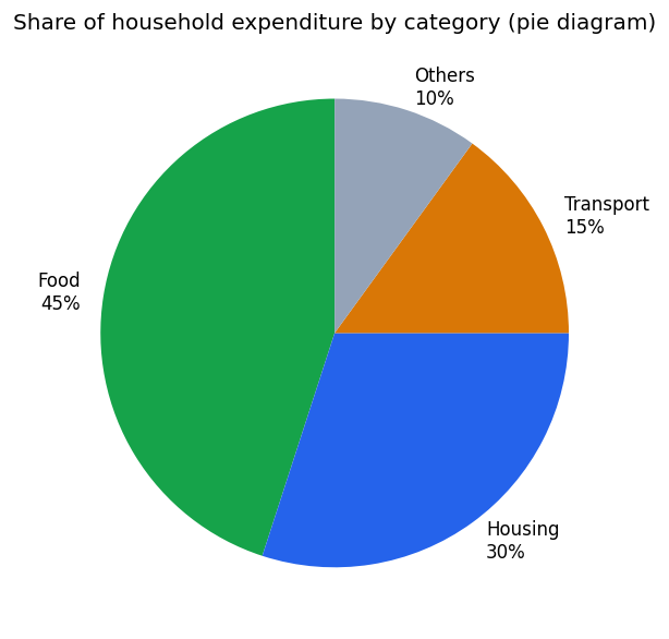
Q563 Marks
Study the pie diagram of household expenditure and answer:
Which category takes the largest share of household expenditure?
AFood
BHousing
CTransport
DOthers
The total angle of a pie diagram representing 100% is:
A360°
B180°
C100°
D90°
When is a pie diagram the preferred form of presentation?
Show answersHide answers
1. Option 1 — Food
2. Option 1 — 360°
3. A pie diagram is best for showing parts of a whole at a single point in time; each slice's central angle is proportional to its share. It becomes unreadable with too many categories or when comparing many time periods — then bar diagrams or stacked bars are more suitable.
Q574 Marks
Based on the given bar diagram, answer the following:
In which year was the production of wheat the highest?
A2018
B2020
C2021
D2022
What was the difference in wheat production between 2018 and 2022?
Which type of bar diagram is shown above?
AMultiple bar diagram
BComponent bar diagram
CSimple bar diagram
DPercentage bar diagram
What does the Y-axis represent in the given bar diagram, and why is it important in data presentation?
Show answersHide answers
1. Option 4 — 2022
2. The difference is 118 - 102 = 16 million tonnes.
3. Option 3 — Simple bar diagram
4. The Y-axis represents the production of wheat in million tonnes. It is important because it provides the scale of measurement, allowing readers to accurately read and compare the values represented by each bar.
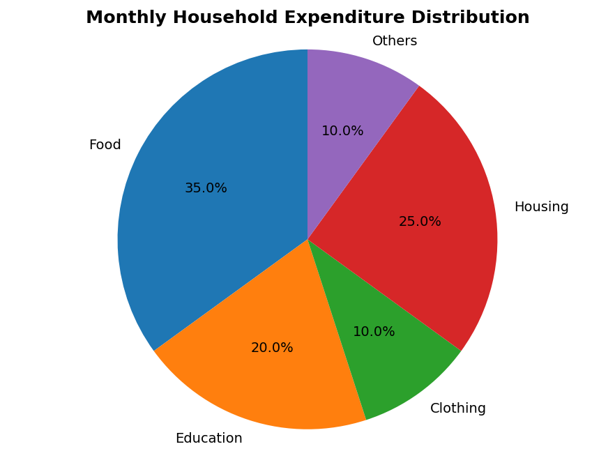
Q584 Marks
Based on the given pie chart showing the distribution of household expenditure, answer the following:
What percentage of household expenditure is spent on Housing?
A10%
B20%
C25%
D35%
If the total monthly income is ₹20,000, how much is spent on Education?
What is the central angle (in degrees) for the 'Food' sector in the pie chart?
A90°
B108°
C126°
D72°
State one advantage and one limitation of using a pie chart for data presentation.
Show answersHide answers
1. Option 3 — 25%
2. Education = 20% of ₹20,000 = ₹4,000.
3. Option 3 — 126°
4. Advantage: A pie chart gives a clear visual impression of the relative share of each component in the total. Limitation: It is difficult to compare two or more pie charts, and it becomes cluttered when there are too many components.
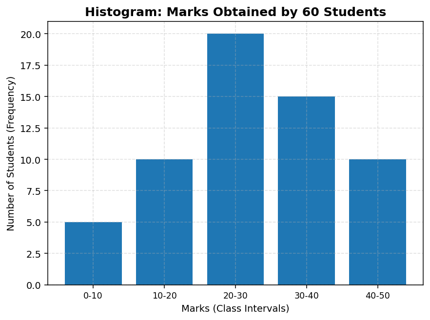
Q594 Marks
Based on the given histogram showing the frequency distribution of marks obtained by students, answer the following:
Which class interval has the highest frequency?
A0-10
B10-20
C20-30
D30-40
How is a histogram different from a simple bar diagram?
What is the total number of students represented in the histogram?
A50
B55
C60
D65
How can a frequency polygon be drawn using this histogram? Explain briefly.
Show answersHide answers
1. Option 3 — 20-30
2. In a histogram, the bars are drawn adjacent to each other (no gap) because the data is continuous, and the area of each bar represents the frequency. In a simple bar diagram, bars have gaps between them and are used for discrete or categorical data.
3. Option 3 — 60
4. A frequency polygon can be drawn by joining the midpoints of the top of each bar in the histogram with straight lines. The polygon is then closed by extending the lines to the midpoints of the class intervals just before the first and just after the last class interval on the X-axis (with zero frequency).